Recognized as one of the 20th Century’s most influential typographers, Hermann Zapf’s iconic career can be summed up in a single word:
Juxtaposition
Born in Nuremburg, Germany, on November 18, 1918, Hermann Zapf’s early years were marked by much turmoil. Germany’s contentious political relationships had created tenuous environments both internationally and within it’s own homeland as authority figures at every level worked to dominate their geographic neighbours, control their soldiers, and oppress their citizenry. Conditions were especially bleak for the Zapf family as their patriarch would be tossed out of the military for his rebellious ideologies, and not long after that, a savage flu epidemic would claim the lives of two of the Zapf children. War, pestilence and widespread economic uncertainty were the lenses through which Hermann Zapf was observing life, and all before the age of three.
By age seven, Zapf was fortunate enough to have been sent to boarding school, affording him three square meals per day, and full access to a library packed with the sort of scientific publications that would ignite young Hermann’s imagination and fuel his desire for knowledge about the physical and natural world surrounding him. It began to look as though a career in this discipline lay in wait, but a portentous encounter at age 17 with the work of Rudolph Koch – a formidable German illustrator and calligraphy expert – would leave an indelible impression upon Zapf, who then went on to immerse himself in texts by Koch, and Koch’s muse Edward Johnston, until he had succeeded in teaching himself the complex art of calligraphy.
Although his goal had been to become an electrical engineer, continued political strife in post-war Germany coupled with his father’s conflicts with the new regime would effectively shut these plans down while at the same time, Zapf’s outstanding artistic skills were opening doors for him thanks to superiors who took note. Zapf eventually embarked upon a 3-year apprenticeship in Nuremburg as a photo-retoucher before moving to Frankfurt where he worked under Paul Koch, son of Rudolph Koch, for the Paul Koch Print House. It was during this time that Zapf delivered his first typeface design. It was christened “Gilgengart” and as this type was cast, so too was a fulfilling future in design.
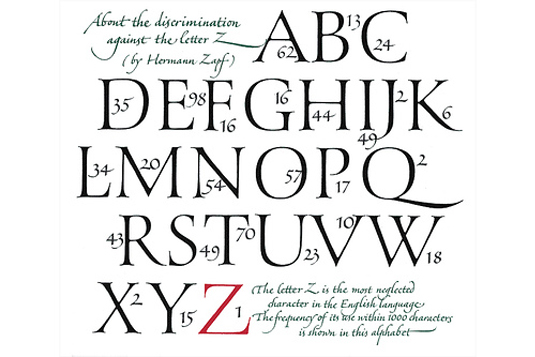
When WWII broke out, Zapf was conscripted into the army where he quickly failed miserably as a gunner. Fortunately, because his talent as an artist had not gone unnoticed, Zapf was repositioned behind a desk, and in place of artillery was entrusted with a selection of pens. It was in this capacity that his war career would flourish as he soon became a much venerated Cartographer. So revered were Zapf’s map rendering and calligraphy skills that even as a Prisoner Of War in France, he was respected as an accomplished artiste, and permitted to retain his drawing instruments and his sketchbooks so that he could continue the work that would lay the foundation for today’s award-winning 1Zapfino typeface.
After the war, Zapf’s expertise kept him employed as an instructor and head of the in-house print shop at the AG Stempel Foundry. And whereas his evolving ideas upon the potential for computer enabled stylized typography were not well-received by the rigid German zeitgeist, his pioneering sensibilities were welcomed heartily in the United States were eventually Zapf’s specialized development of programs for typographic structures led to the creation of 2“Optima” and 3“Palatino.” These popular typefaces were originally developed for metal castings in the ’40s and ’50s but having stood the test of time, both have successfully spanned the metal setting-turned-digitized software trajectory.
And so it was that in spite of the ravages of plague; two World Wars; and, a Utilitarian culture rooted in repression and rigidity, beauty in communication did bloom and flourish at the hands of Hermann Zapf.
FOOTNOTES
1Zapfino
-
classified as an Old Style script typeface, drawing inspiration from 17th and 18th Century handwriting which would have been rendered by quill
-
based on an alphabet that Zapf originally penned in 1944 but was released digitally in 1998 (Zapf had previously tried to create a calligraphic typeface for Stempel in 1948, but hot metal composition was too limiting on the freedom of swash characters)
-
features a system of thick and thin tapered strokes, and makes extensive use of ligatures and character variations (for example, the lower case letter “d “ has nine variations)
-
for each character there are four alternative versions and accompanying fonts of ligatures and ornaments
-
The basic Zapfino font family consists of four alphabets with many additional stylistic alternates that can be freely mixed together to emulate the variations in handwritten text
-
Zapfino Extra has special characters with more elaborate ascenders and descenders for certain letters and is best used at the beginning of a word or to even out the spacing of the characters.
-
Zapfino Extra features a main alphabet containing regular capitals and three supplementary alternate fonts with swash capitals, lower-case variants, ligatures and big flourishes ( hyper-flourishes) which can take up to 4 lines of type
2Optima
-
classified as an Old Style script typeface, drawing inspiration from 17th and 18th Century handwriting which would have been rendered by quill
-
based on an alphabet that Zapf originally penned in 1944 but was released digitally in 1998 (Zapf had previously tried to create a calligraphic typeface for Stempel in 1948, but hot metal composition was too limiting on the freedom of swash characters)
-
features a system of thick and thin tapered strokes, and makes extensive use of ligatures and character variations (for example, the lower case letter “d “ has nine variations)
-
for each character there are four alternative versions and accompanying fonts of ligatures and ornaments
-
The basic Zapfino font family consists of four alphabets with many additional stylistic alternates that can be freely mixed together to emulate the variations in handwritten text
-
Zapfino Extra has special characters with more elaborate ascenders and descenders for certain letters and is best used at the beginning of a word or to even out the spacing of the characters.
-
Zapfino Extra features a main alphabet containing regular capitals and three supplementary alternate fonts with swash capitals, lower-case variants, ligatures and big flourishes ( hyper-flourishes) which can take up to 4 lines of type
3Palatino
-
named after 16th Century calligraphy master: Giambattista Palatino
-
began as an Old Style Serif rooted in the Humanist fonts of the Italian Renaissance
-
was released in 1948, and has enjoyed many iterations since in order to incorporate extended Latin, Greek and Cyrillic character sets
-
offers a calligraphic grace but with larger proportions, open counterforms, generous width and an absence of exaggerated ascenders and descenders that make it a more readable typeface
-
Palatino Sans and Palatino Sans Informal retain Palatino’s classical heritage while the curved outlines that echo handwriting add a warmer, more organic feel. This direction is taken further in the Sans Informal, which introduces playful, spontaneous elements not typically associated with Palatino. Palatino Sans Ultra Light integrates the variations of stroke created by the human hand when writing, providing an elegant face for such applications as healthcare and beauty. The new faces are designed to work together as a system, in conjunction with the many styles and weights of the Palatino nova family, for example by setting headlines in Palatino Sans and body copy in Palatino nova (http://www.graphics.com/modules.php?name=News&file=article&sid=3496)
